Groove / dance studio booking app
Dated: Jul to Sep, 2022
Platform: Mobile App
Built on : Figma

What...
A mobile app that is dedicated to booking dance classes. Through this app users can find dance classes near them based on any genre they want to try out as well as the added advantage of choosing how and when to try out these lessons.
Why...
An app dedicated to booking dance lessons does not exist in the market currently. Such a product also reduces the need for studios to conduct free promotional workshops because peeple will be willing to try out a single class to decide.
My role
As a part of the Google UX Design Course, this was the first studio project which was entirely designed by me which involved user research, ideating, defining, prototyping and testing phases.

User Flow
This user flow consists of every screen and elements present in the app. All sub screens leads to the main process which involves searching for the right studio and booking a daily or monthly slot.

Navigation Bar
The navigation bar consists of four main pages: Home, events, account and my classes. All these pages except accounts page redirects the users to the main user flow for booking a studio. The accounts page is designed to customize the user's account details.

Booking a Studio
This is the main flow of the app that a user will have to complete in order to book a studio. It involves searching, selecting specifics and paying for a studio session.
The Design Process

User Persona
A mixed group of people who have or are currently attending dance classes were asked questions about how they searched or found dance classes. A lot of users had common issues regarding studio information which posed as the main user problem.
Information
Websites don’t have enough pictures representing studio space and culture. Clients would like to see the space online before visiting.
Constraints
Most places have fixed schedules per month which does not work for the user group. Possible trial classes or single classes needs to be an option.
Short & Precise
Information provided by studios are too elaborate and demotivating. There are specific criteria that clients look for and those information should be easy to find
Consistency
The information about studios are not consistent and often obscure. Users would have to visit the place to see for themselves which might be discouraging.
User Pain Points
A compilation of the commonly occuring frustrations that people face when lookinh for a dance class to attend. These pain points have included frustrations faced during online searches as well as those faced when visiting a studio. These pain points will be a key factor in defining the problem.

User Journey Map
Listing out challenges that users faced particularly when searching for dance lessons online helped map out the tasks required to complete the user journey. Challenges faced when searching for studios through ads or word-of-mouth also helped in creating a more reliable user journey.


Paper Wireframes
These paper wireframes were the finalised format for each screens listed in the user flow. Scope to improve the user flow was also noted while making paper wireframes.
Each screen was drawn with 3-5 different patterns and iterations. The finalised screen was always a combination of the best features that could be included from each iteration. Here is an example of 6 different versions of the homescreen.


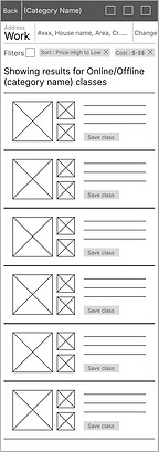

Digital Wireframes
Finalised paper wireframes were transferred to digital format. The digital format helped understand scale and proportions down to minor details. This is also the stage where typography, heirarchies and shade values can be deternimed. The digital wireframes were then converted to Lo-Fi prototypes, ready for usability testing.

Affinity Diagrams
The observations noted down during usability testing were prioritised into sections of the design that participants had the most trouble with. This exercise helped identify the themes of problems that interfere with the user flow.
Date Selection
Users would like to see how they can select dates and apply other changes to their class schedule.
Booked Classes
Once you book a class how do users access that information again? They'll need it while attending class.
Loop the Flow
Completing a flow by giving an option to go back to homescreen once the task is complete.
Usability Study Findings
A usability study was conducted on 5 participants with the Lo-Fi prototype. The users tasked with completing 2 tasks and their reactions, process and hesitations were all recorded and compiled using affinity diagrams and narrowed down to three main problems.


Mockup 1st cut
This mockup designs havd a clear indication of the visual elements that needed to be used in the app but is failed to stay on brand. The visual elements needed one final revision before they could compliments each other.
Prototype link
Please use the link below to try out the interactive version of this app.